OVERVIEW
Brookvale Vineyards is a conceptual brand identity created for a premium wine company as part of an advanced typography course. The project involved designing a full brand system—including a logo, wine labels for both a Chardonnay and a Malbec, and supporting promotional materials. My vision was to create something elegant and luxurious, but also expressive, engaging, and full of personality—challenging the idea that high-end design must be minimal to be taken seriously.
My Role
Brand Designer
Logo design, wine label packaging, promotional material design, typographic system
Tools
Adobe Illustrator, InDesign, Photoshop
Concept & Design Approach
Brookvale Vineyards was crafted to feel refined and high-end, without being cold or overly minimal. From the start, I wanted to create a brand identity that embraced both sophistication and visual storytelling.
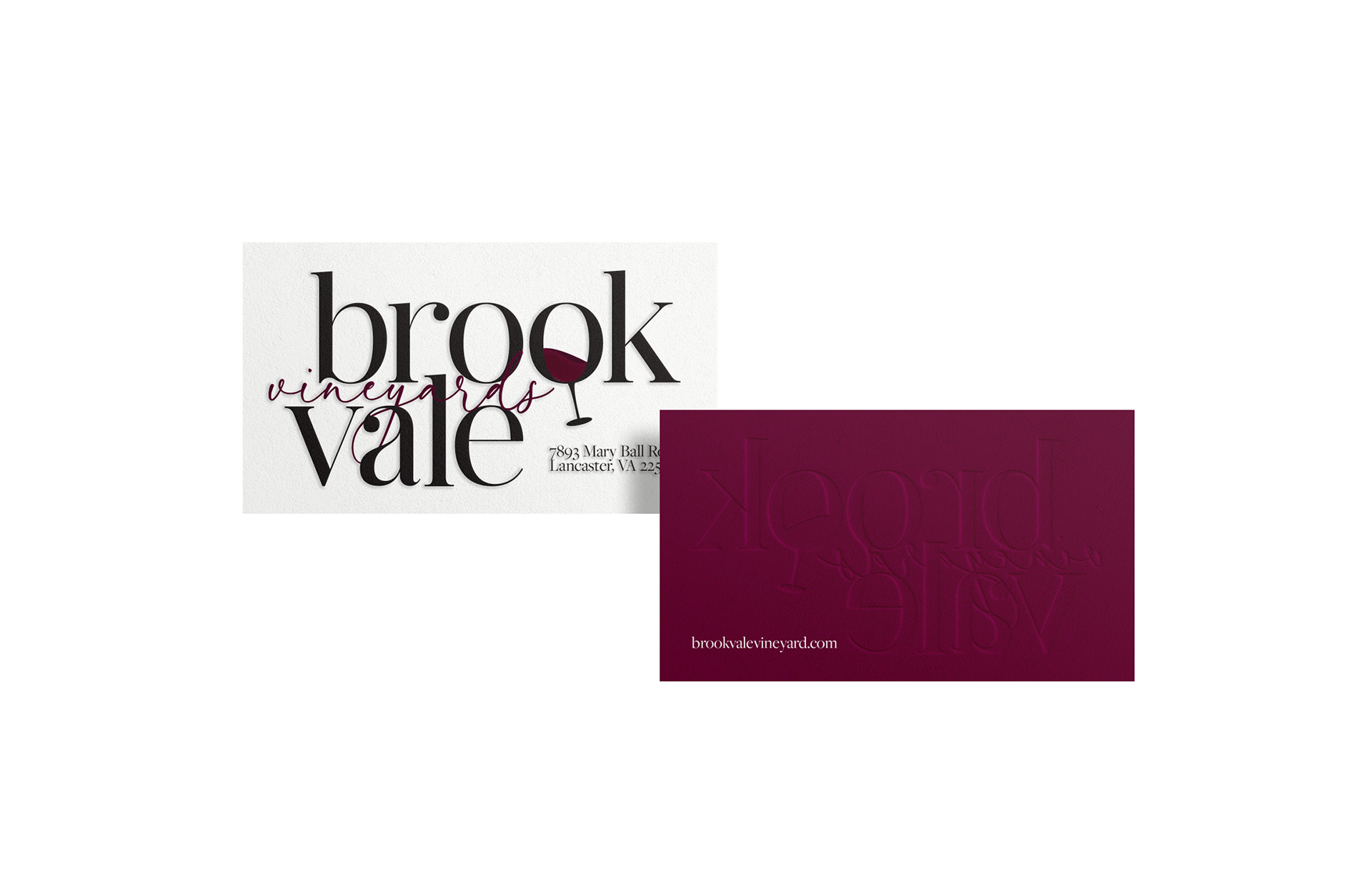
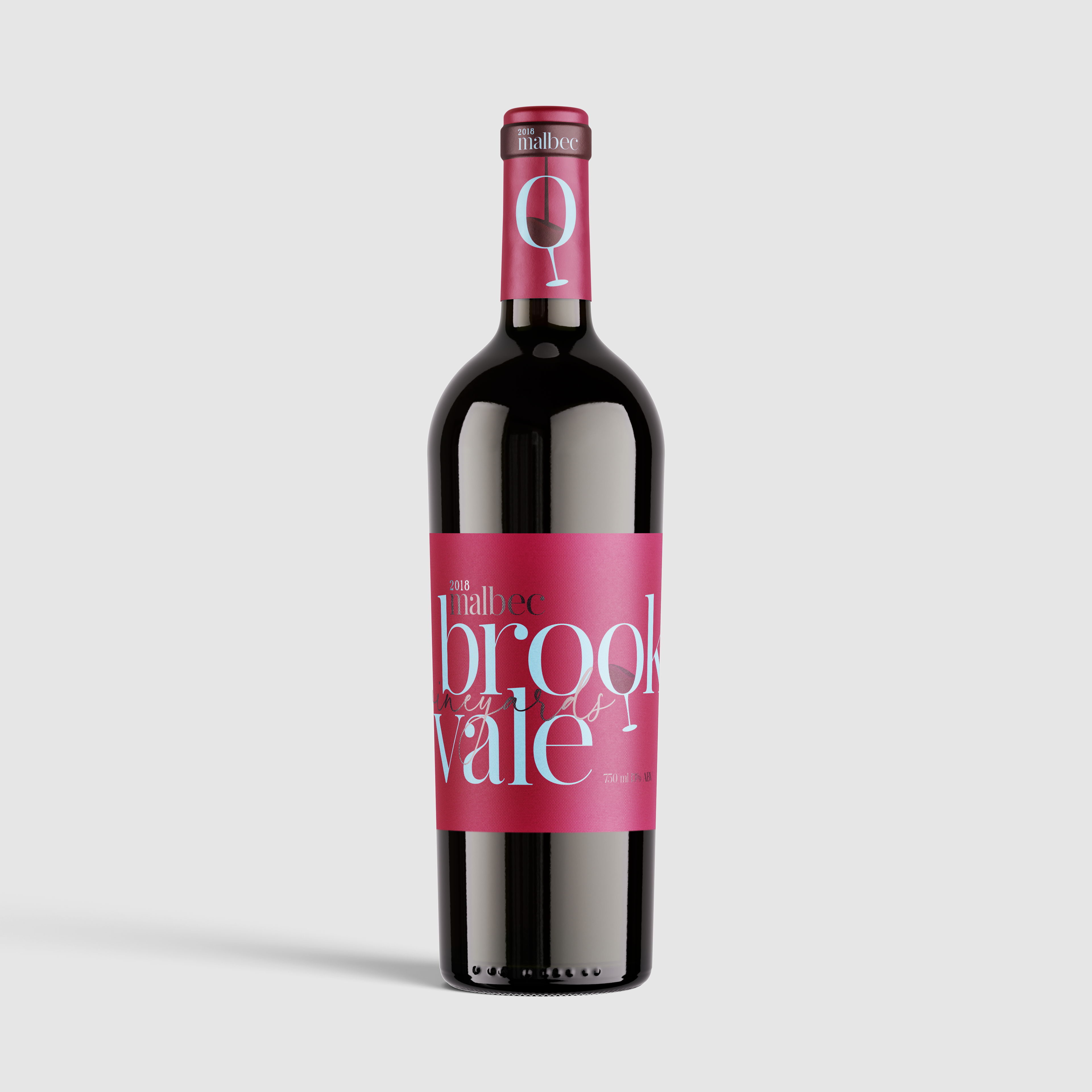
One of the most defining features of the design is the custom logo, where the second “O” in “Brookvale” is transformed into a wine glass silhouette. This allowed the actual color of the wine (from the label beneath) to show through, making the logo interactive, memorable, and product-specific. It functioned not only as a letterform, but also as a logomark—giving the brand a signature look while instantly communicating what it represents.
Each wine label was designed to reflect the character of the wine: the Malbec features deep, rich tones and a moody elegance, while the Chardonnay has a lighter, brighter feel. While keeping the overall structure clean and organized, I incorporated nuanced design elements that added vibrancy and warmth to each label, creating a sense of joy and celebration around the wines.
Typography Challenge
One of the unique hurdles of this project was the length of the brand name itself. “Brookvale Vineyards” is visually long, and finding a layout that allowed it to remain legible, balanced, and elegant—without crowding the label—required careful typographic choices and spatial planning. It pushed me to really refine the logo composition and ensure the final result felt seamless.
Promotional Materials
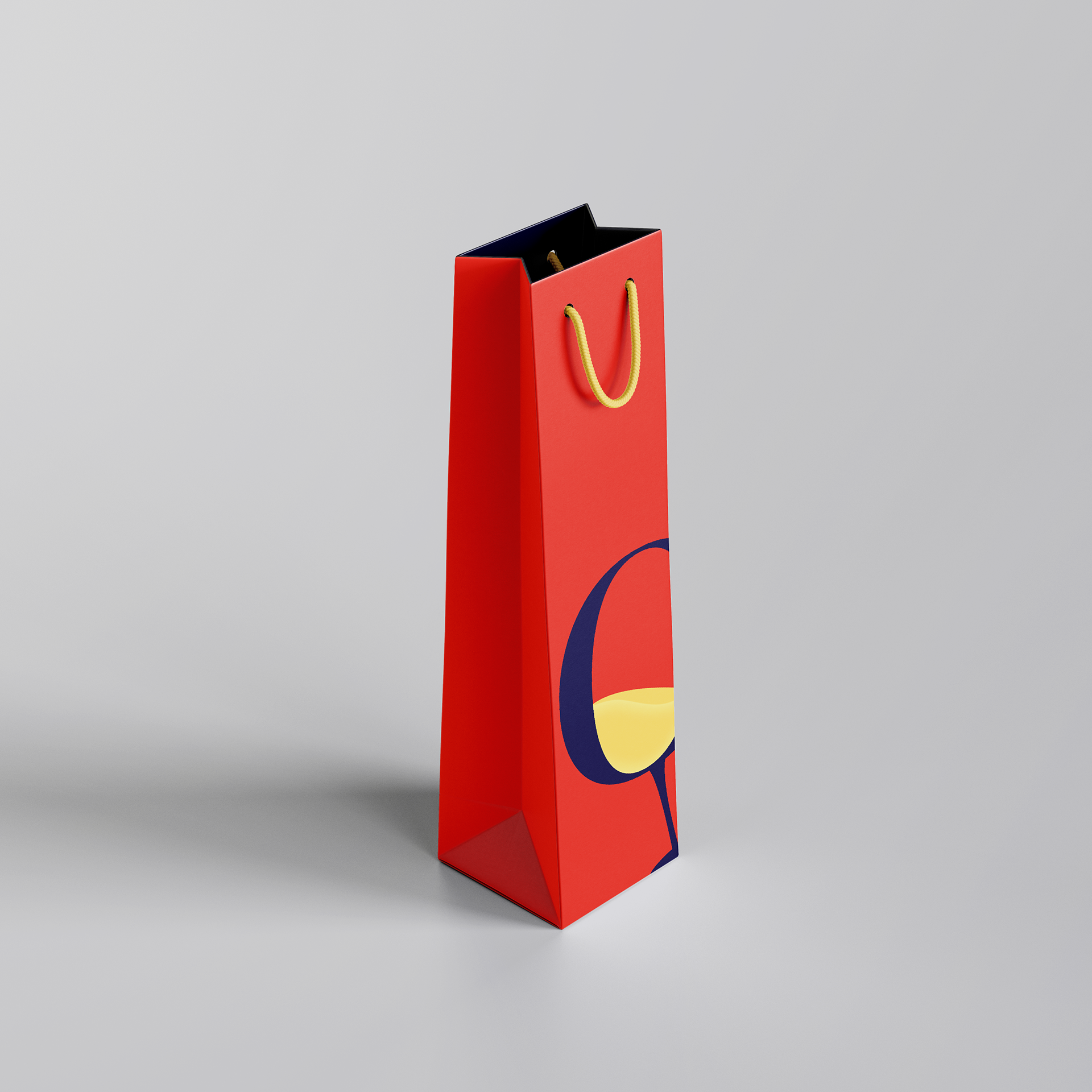
To complete the brand system, I designed custom gift bags for each wine, reflecting the tone of the labels and offering a luxurious unboxing experience. I also created an embossed business card for the vineyard, using tactile printing to enhance the sense of refinement and attention to detail.
Challenges
Beyond the brand name length, the biggest creative challenge was balancing a visually rich, illustrative design with the high-end expectations of a wine brand. Many wine labels default to sparse, neutral minimalism, but I wanted Brookvale to show that luxury doesn’t have to mean boring or empty. The final identity walks the line between elegance and vibrancy, offering a fresh take on what premium wine packaging can be.
Outcome
Brookvale Vineyards is a brand built on the belief that luxury can still have personality. It’s bold, elegant, and visually engaging, with design elements that are both beautiful and functional. This project strengthened my skills in typography, brand storytelling, and packaging—and reflects my passion for creating thoughtful, elevated design experiences that connect visually and emotionally.