


OVERVIEW
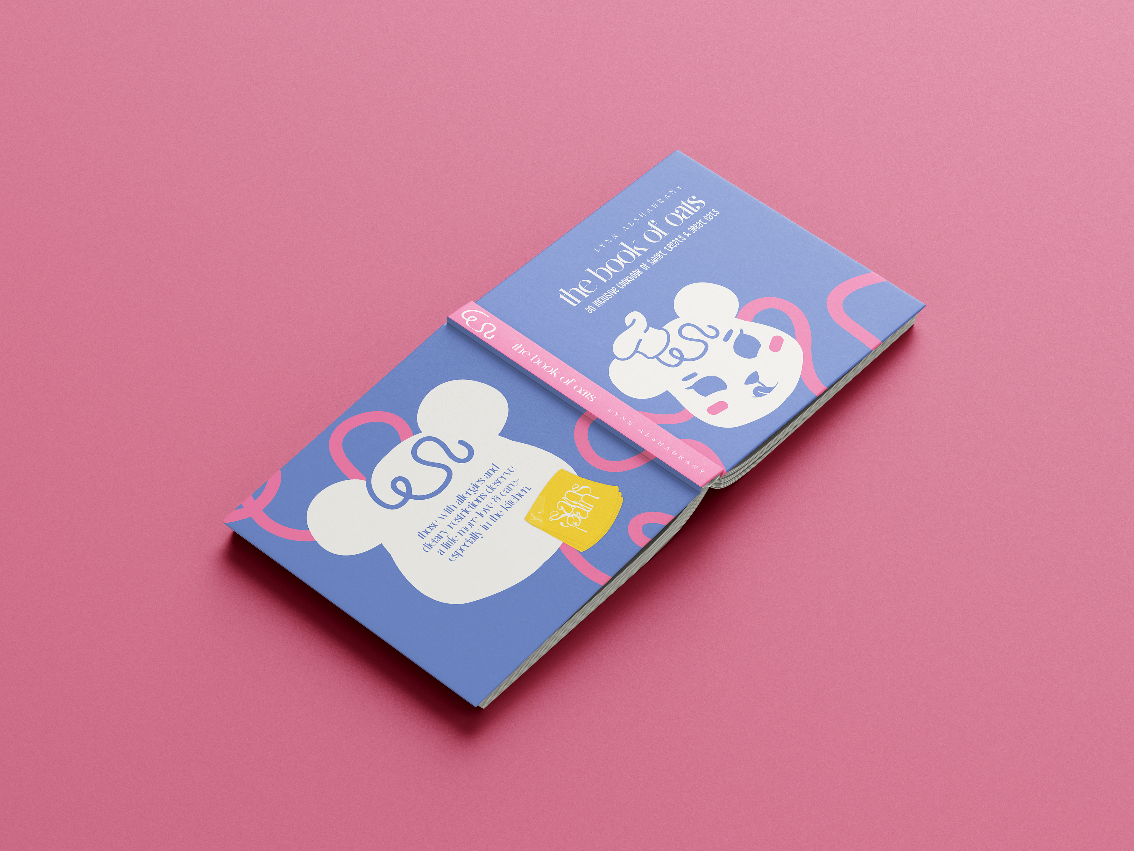
The Book of Oats is a fully illustrated, allergy-friendly cookbook created under the brand Sans Pain—French for “without bread,” and a soft nod to “without pain.” Designed as the centerpiece of my senior design project, it is rooted in personal experience and driven by empathy. The goal was to create something that didn’t just make food safe—it made it joyful, beautiful, and deeply inclusive.
MY ROLE
Creative Director, Designer, Illustrator, Recipe Developer, Researcher
I led every part of this project—from branding and hand-lettering the logo to developing recipes, illustrating every page, writing all the content, and designing promotional materials for my senior gallery show.
I led every part of this project—from branding and hand-lettering the logo to developing recipes, illustrating every page, writing all the content, and designing promotional materials for my senior gallery show.
TOOLS
Adobe InDesign, Illustrator, Photoshop, Procreate
TIMELINE, SCOPE, AND COMMITMENT
This project was completed in under two months—entirely on my own—while simultaneously juggling my other college courses. The timeline was accelerated so I could have the cookbook printed, bound, and ready in time for my senior gallery show. Managing such a large-scale, multifaceted project under time pressure demanded intense focus, adaptability, and dedication.
RESEARCH & STUDY
Having never created a cookbook before, I committed to extensive research. I studied:
- How cookbooks are written and structured
- What makes recipes functional and enjoyable
- What readers value (or dislike) in cookbooks
- How to design for people with dietary restrictions with empathy and insight
User-centered design was at the heart of the process. I wasn’t just designing for people with allergies—I am that person. I wanted the experience to feel welcoming, empowering, and full of possibility.
VISUAL DIRECTION
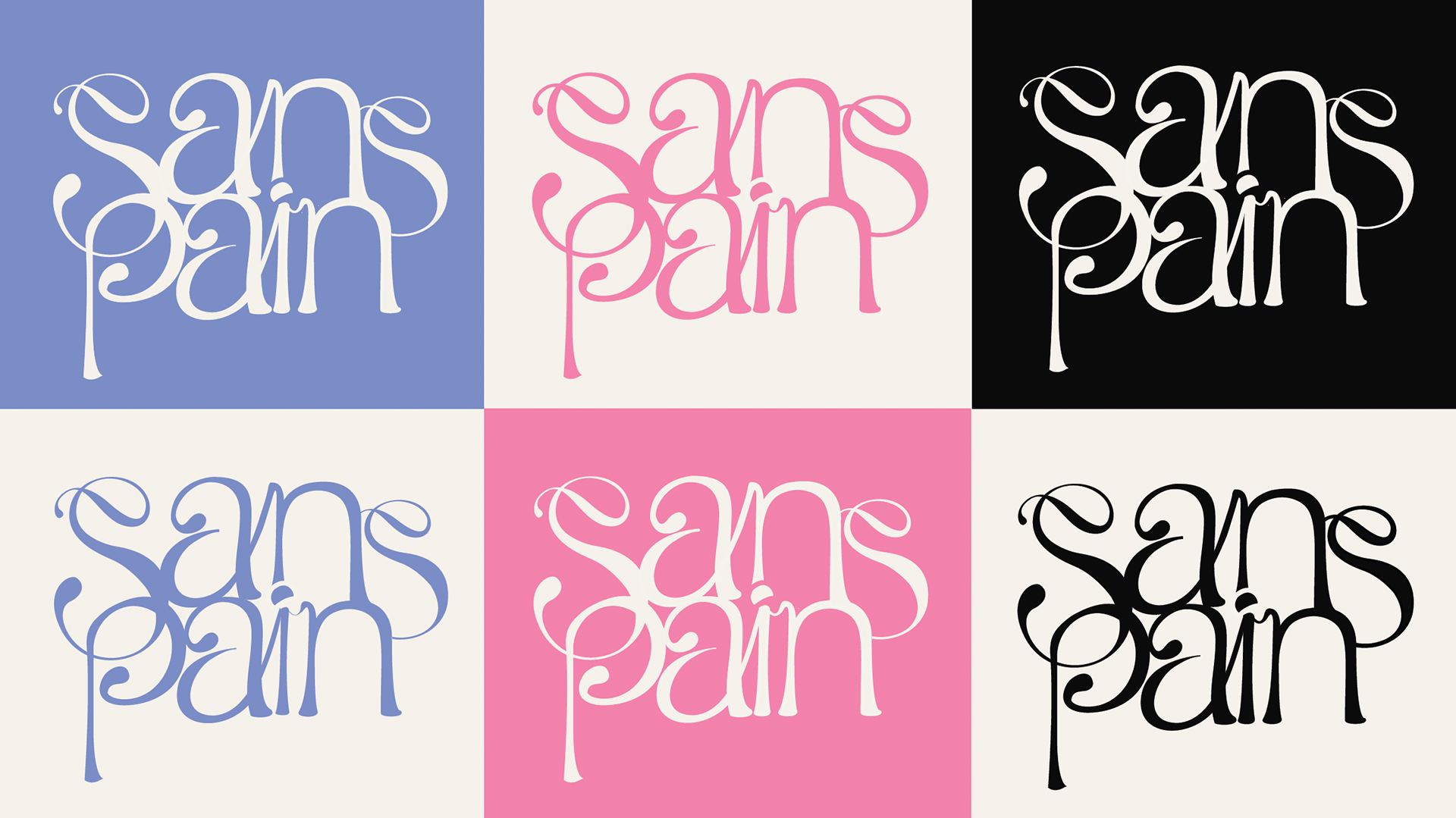
The Sans Pain brand began with a hand-lettered logo inspired by Parisian French gates—symbolizing openness, comfort, and timeless beauty. Every illustration in the book was created by me using digital illustration, which I was learning for the first time during this project. Transitioning from traditional media to digital was a major challenge, but it allowed me to shape the visual tone exactly as I envisioned: playful, soft, and emotionally warm, while still clear and practical for real-life use.
CONCEPT & CONTENT
Each recipe is built around one powerfully versatile ingredient: oats. From sweet to savory, oats became the anchor for a cookbook that’s flavorful, allergen-friendly, and unexpectedly exciting. I personally developed and tested many of the recipes, determined to create food that felt indulgent and creative—not just tolerable.
Too often, allergy-safe food is reduced to “edible”—but this book was created to show that safe food can still be beautiful, fun, and full of life.
EDUCATIONAL IMPACT
Beyond recipes, The Book of Oats is also an advocacy tool. It offers educational content on:
The difference between allergies and intolerances
The seriousness of cross-contamination for those with celiac disease
How to safely prepare a kitchen for someone with strict dietary needs
The science of replacing gluten in baking and cooking
The tone is designed to inform while remaining gentle and approachable—like a friend guiding you in the kitchen.
PROMOTIONAL MATERIALS & GALLERY INSTALLATION
To bring the brand into a physical space, I designed and hand-produced stickers and tote bags that accompanied the cookbook at my senior art gallery show. But the gallery wasn’t just a display—it was an experience. I carefully curated the setup to feel comforting, welcoming, and inviting, mirroring the same emotional tone as the cookbook itself. Every detail was considered to help people feel at ease and connected—from the layout of the space to the tactile objects they could take with them. It was more than a showcase—it was a celebration of care.
CHALLENGES
This project pushed me in every direction. I worked within an extremely short timeline, learned digital illustration from scratch, developed recipes, wrote content, and produced every part of the brand—while simultaneously completing my other coursework. Designing a cohesive system that balanced accessibility, visual engagement, and education was no small task. But I poured my heart into every page because I knew what it meant—to me and to others.
OUTCOME
The Book of Oats is more than a cookbook. It’s a love letter to anyone who’s ever felt left out because of their dietary restrictions. It’s design that embraces empathy, inclusion, and joy. It’s proof that beautiful, thoughtful design can inform, empower, and comfort—all at once.
This project will always be one of the proudest, most meaningful chapters in my creative journey.